OVERVIEW
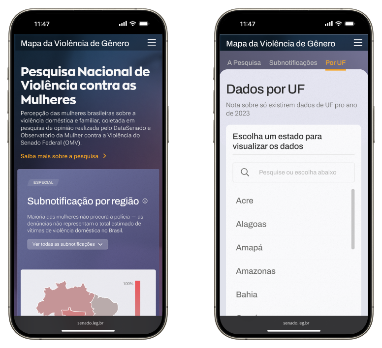
The Mapa Nacional da Violência de Gênero portal consolidates public data on violence against women in Brazil.
The 2 times prize-winning portal, was awarded in 2024 both the "Qlik Global Transformation Award" and the "Cláudio Weber Abramo Award for Data Journalism" on the "Open Data" category (the most important data journalism award in the country).
As Sole Designer, I was responsible for all design aspects, from guiding the process and developing prototypes and identity to managing stakeholder relationships.
SERVICES
Product Design
Brand Identity
Data Visualization Design
Information Design
Content Strategy
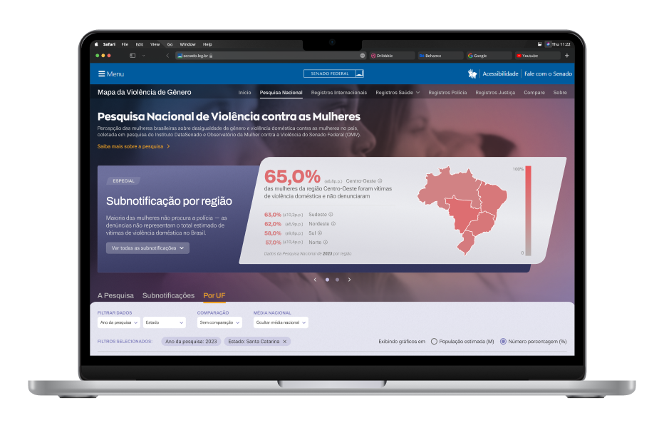
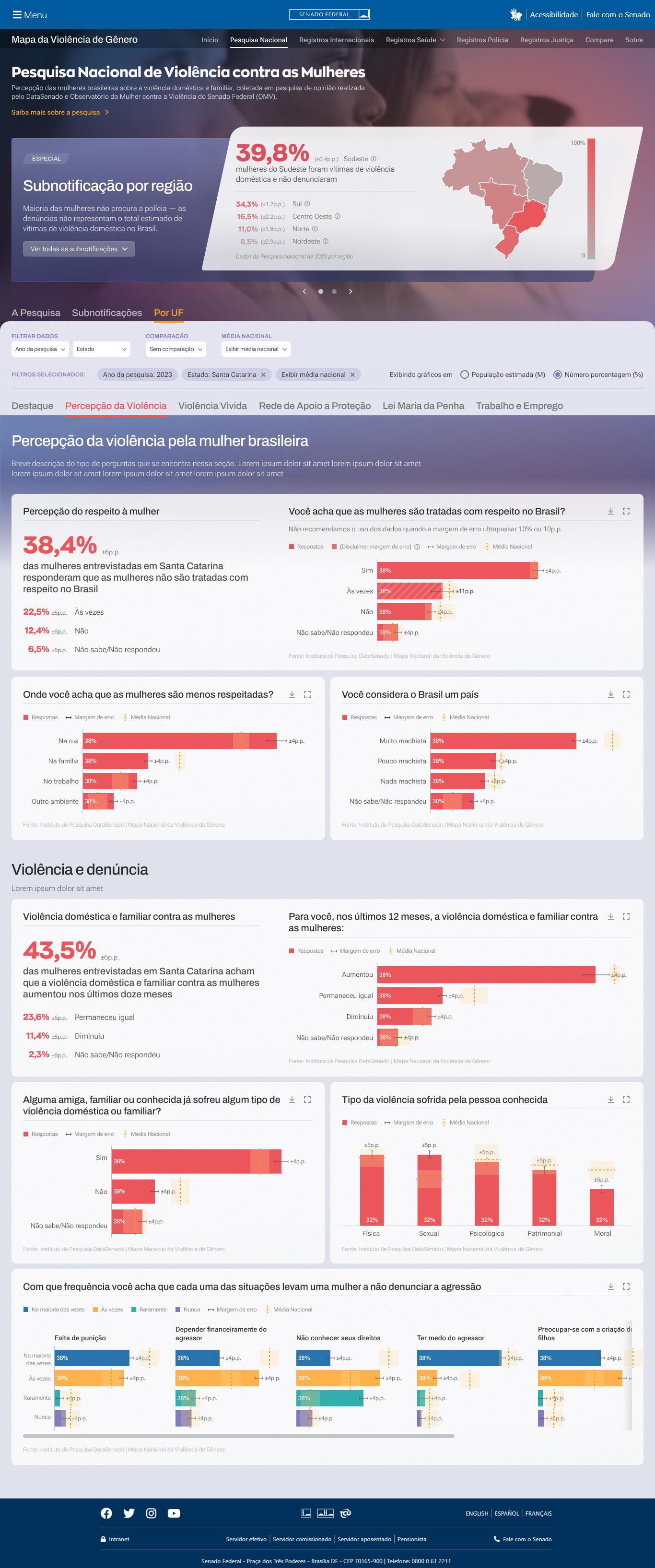
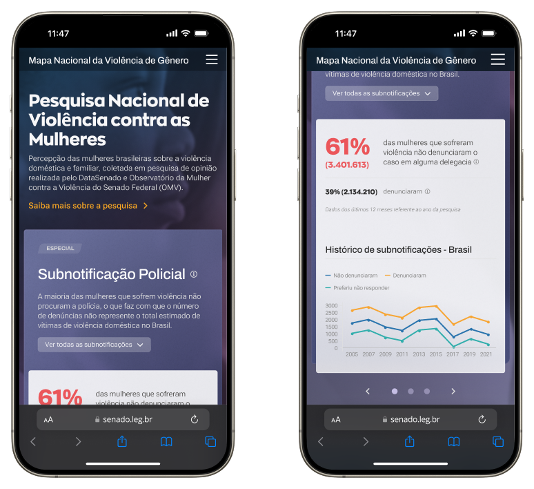
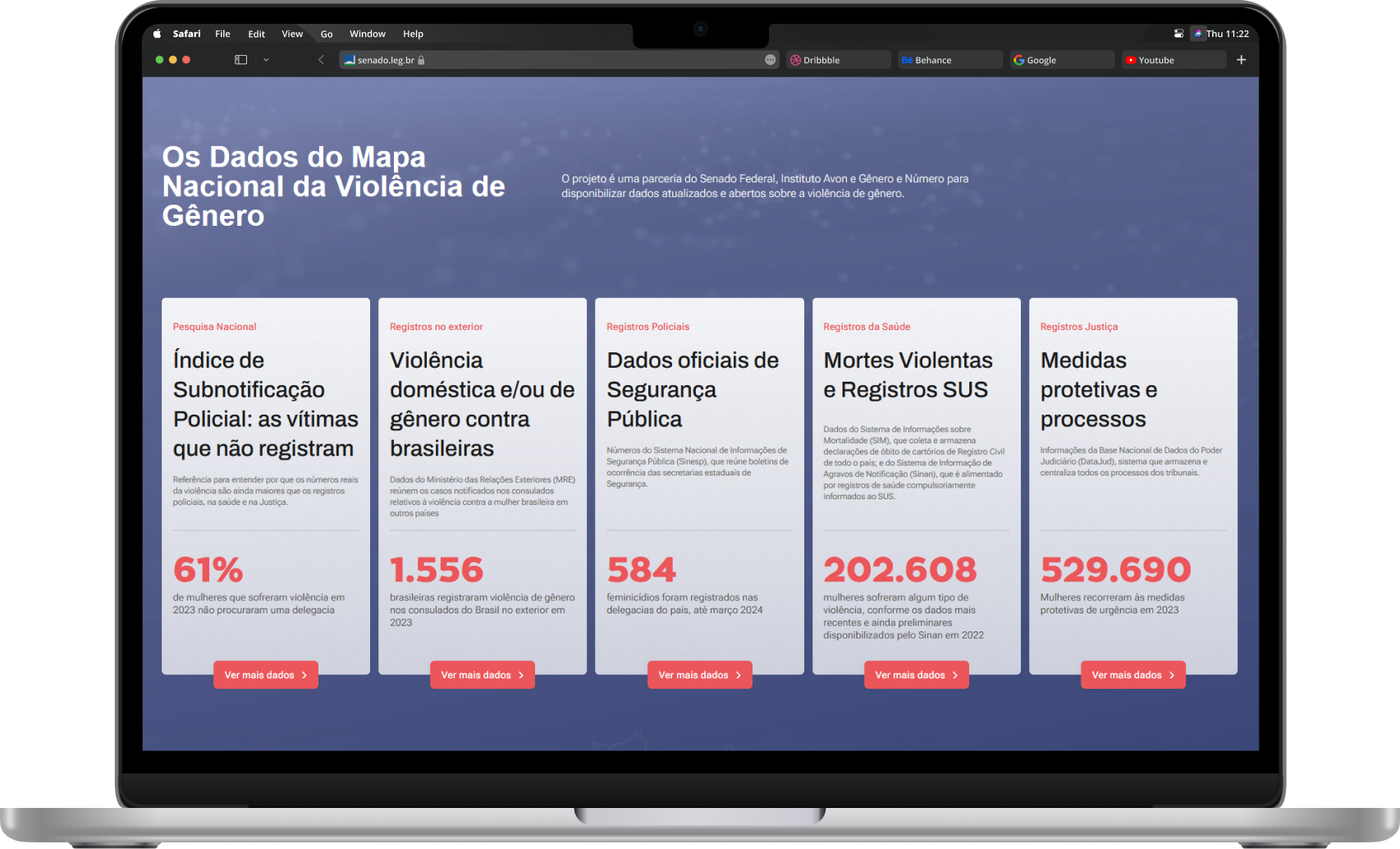
The banner at the top of every page provides an overview that invites the user to explore more
The data comes from multiple sources such as the databases of the Ministry of Justice and
Public Security (Sinesp), the Ministry of Health (DataSUS), the National Council of Justice
(DataJud), and the Federal Senate (National Survey on Violence Against Women - DataSenado/OMV).
The portal also made available inedit data provided by the Ministry of Foreign
Affairs (MRE) on cases reported to consular officces regarding violence against Brazilian women
living abroad.
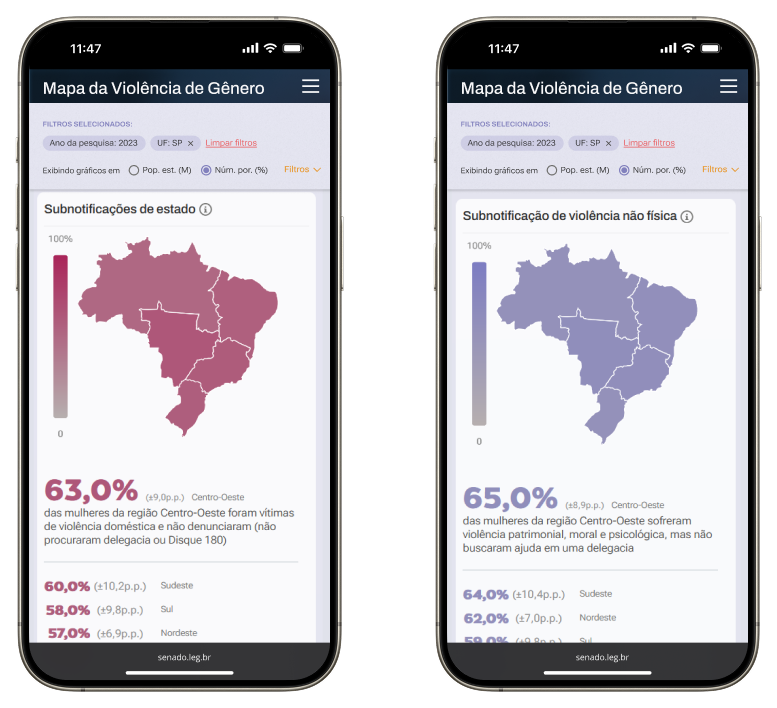
Some of the challenges we had, besides the requirement of having data visualization charts
on mobile devices, we had the task of making data accessible to a wide range of users: from
lay people to scholars, journalists and government areas.
Being a delicate subject that can be easily become tiresome and heavy to read, it was
designed in a progressive disclosure way to ease the cognitive impact. That's also one of the
reasons why most of the charts are bar charts: reduce cognitive overload.
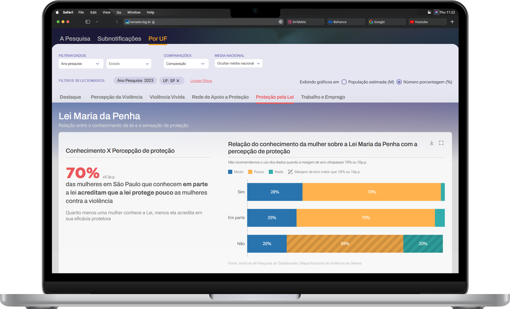
A surface level of data is available as a starting point. As the user explores
and interacts with the platform, more complex and heavy data will be displayed. The page filters
also help to filter and drill down the data. This way we can cater to the needs of both publics,
because the ones who needs complex data will still need a insight as starting point.
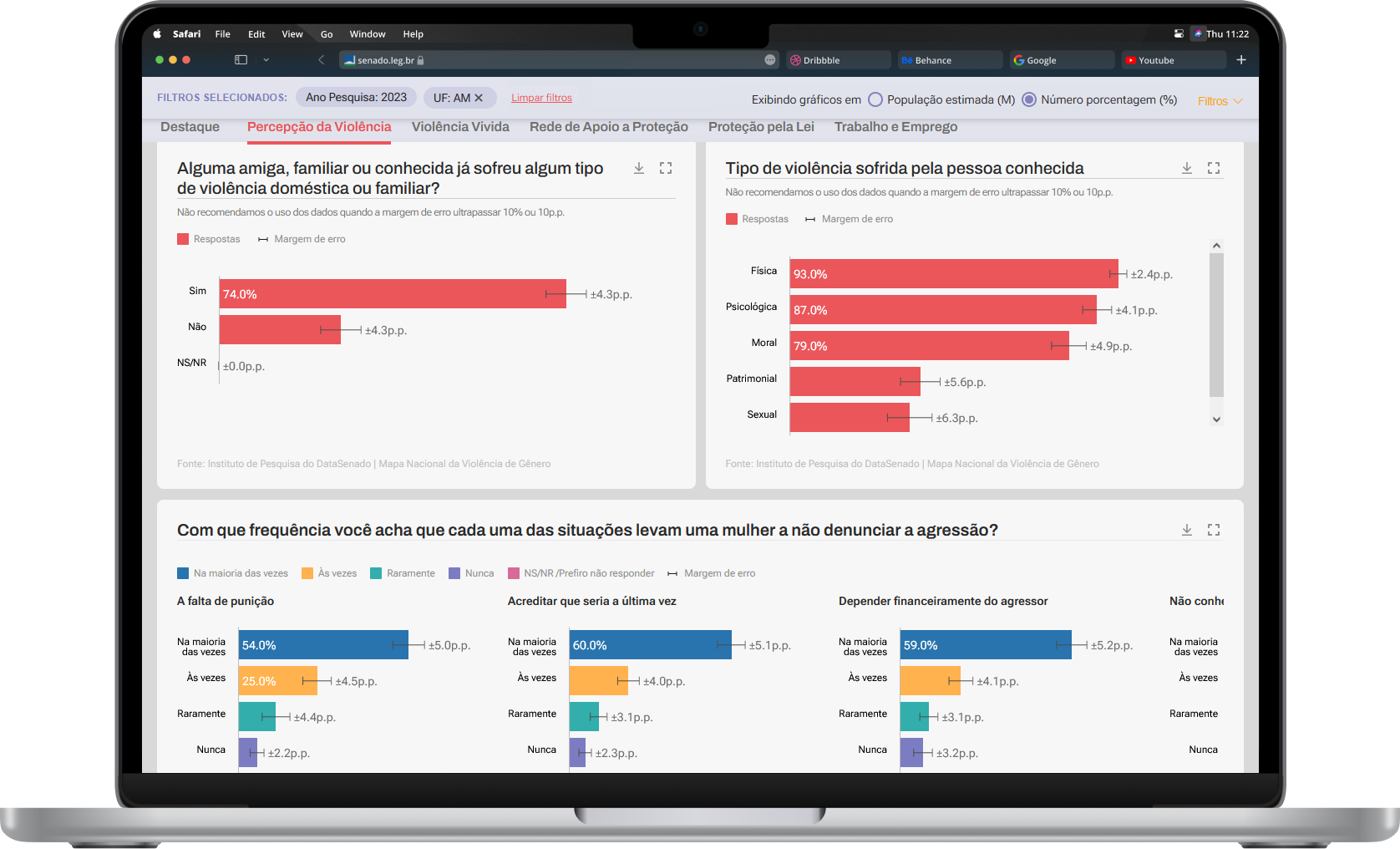
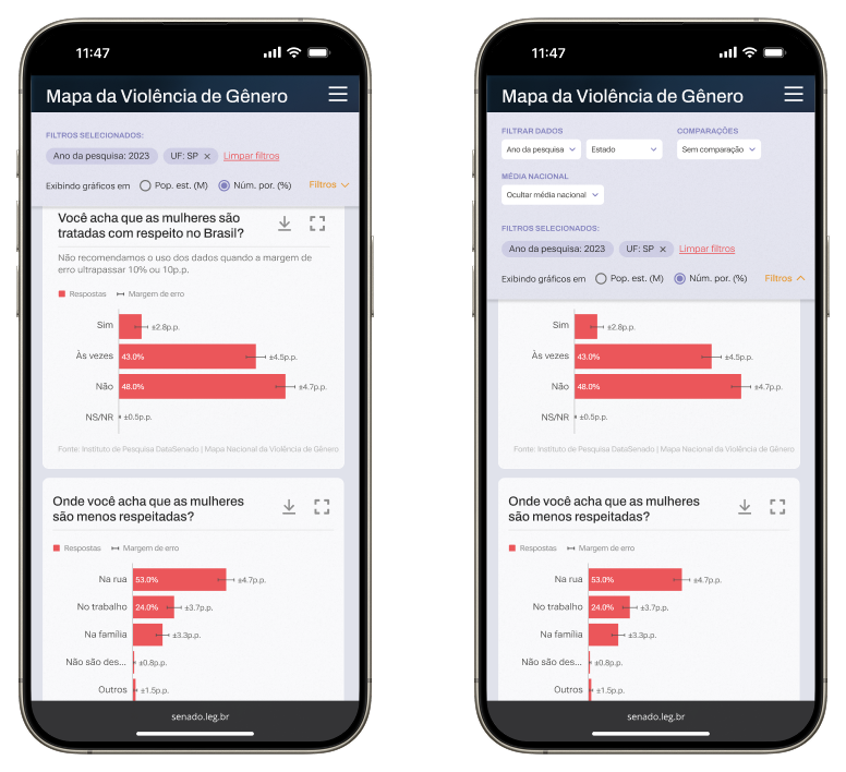
Small multiples favors both the comparison between bars within the same chart as well as same colored bars across different charts.
Another project requirement was to be able to customize how you visualize data. For instance, below
you can see the same set of data in percentage values, with and without the National Average
(selected through a filter), and in total amount.
This result was challenging to achieve while taking into account the previous requirements
plus having the error margin visible at all times, a requirement from the statistics team.
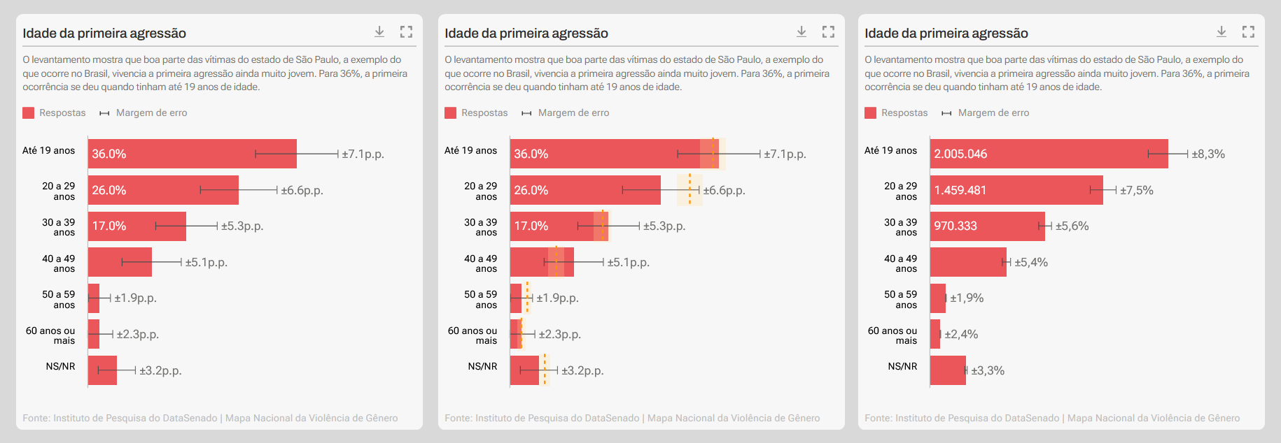
Example showing: percent values and error margin only; error margin and national average; and error margin only but values in total amount
